A simple black and white illustration of a magnifying glass, symbolizing the diligence in shirk trucking, appears on a light beige background, positioned on the left side with ample empty space on the right.
Back to Full Portfolio

SWCS Insurance

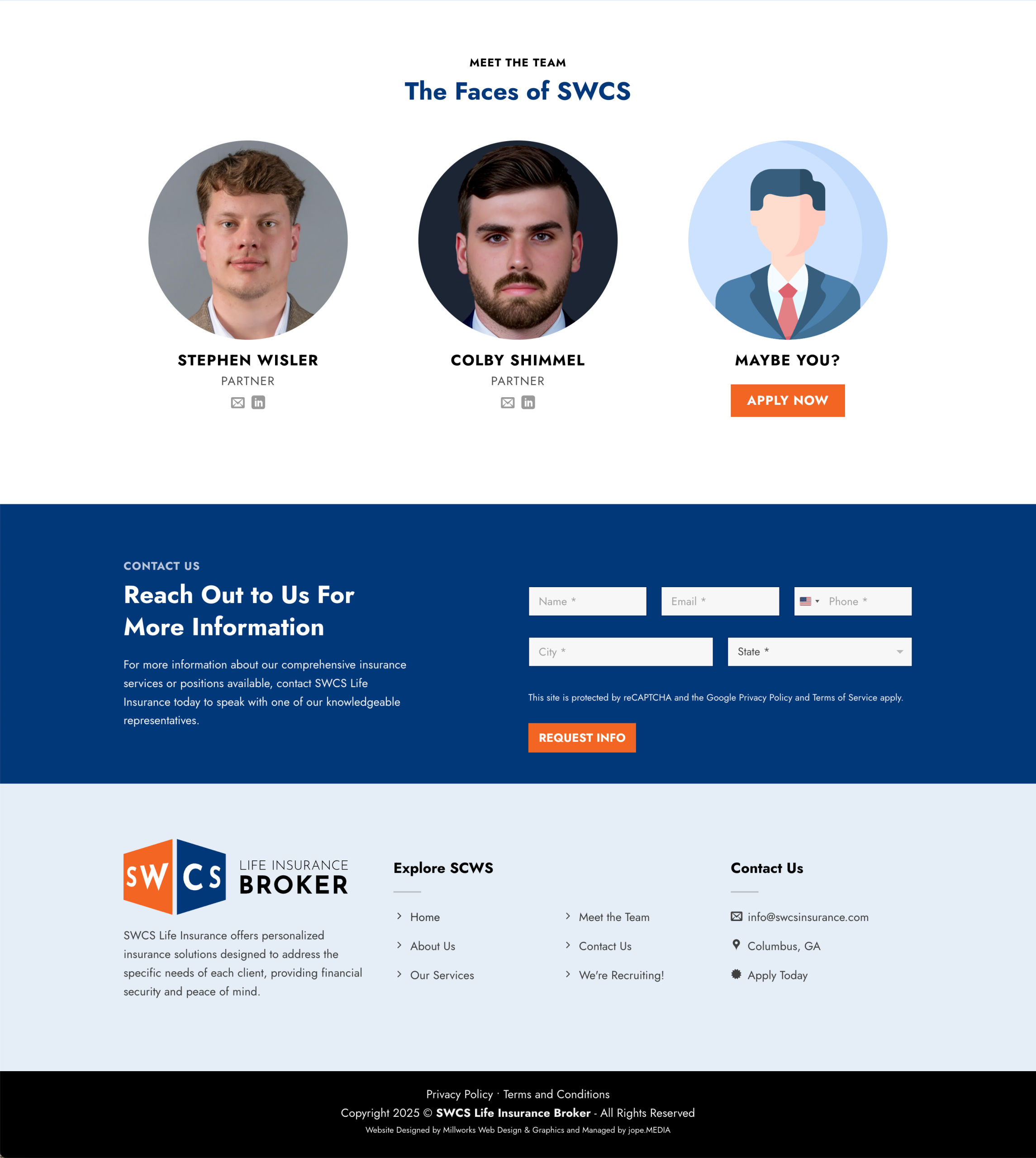
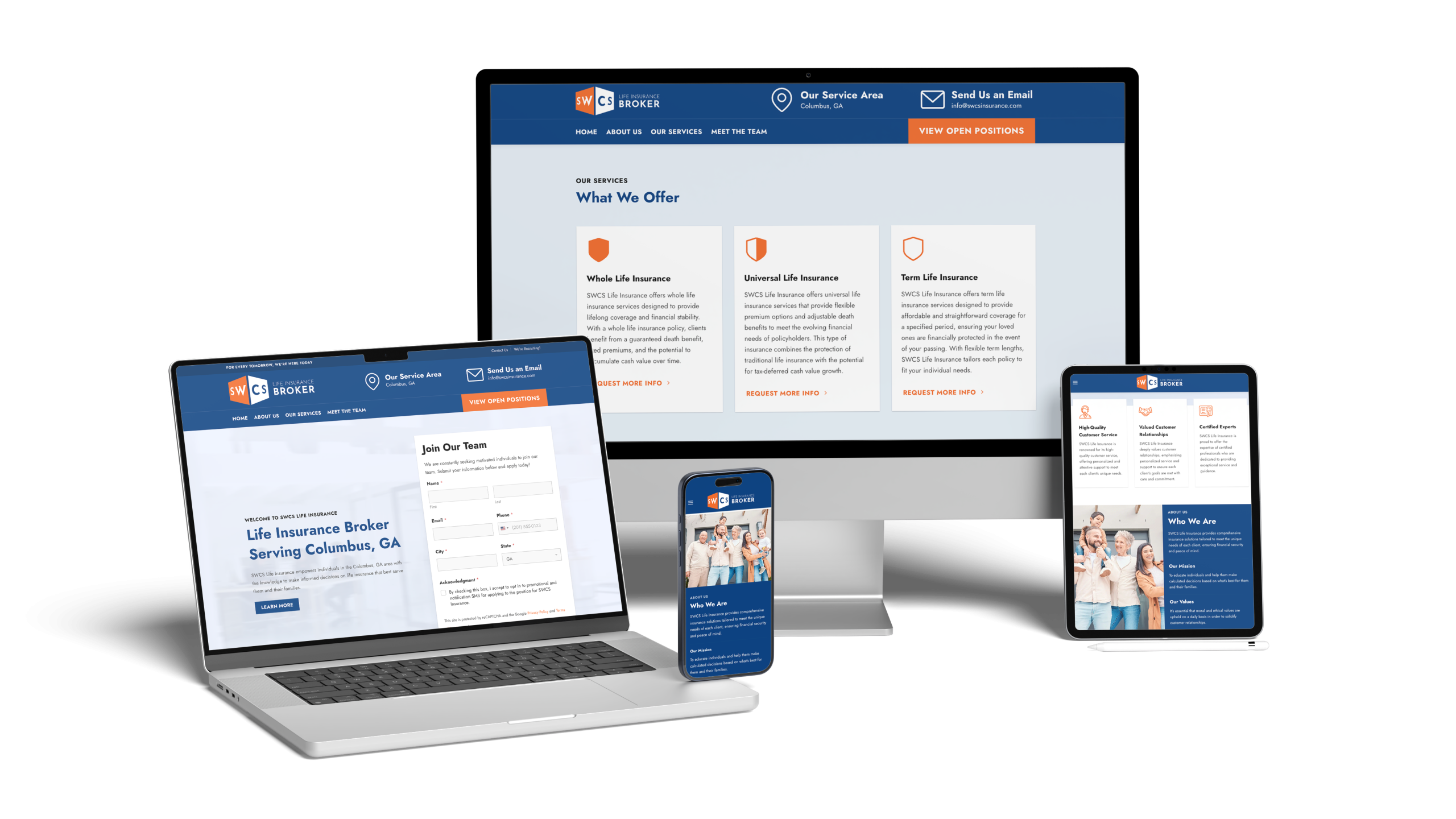
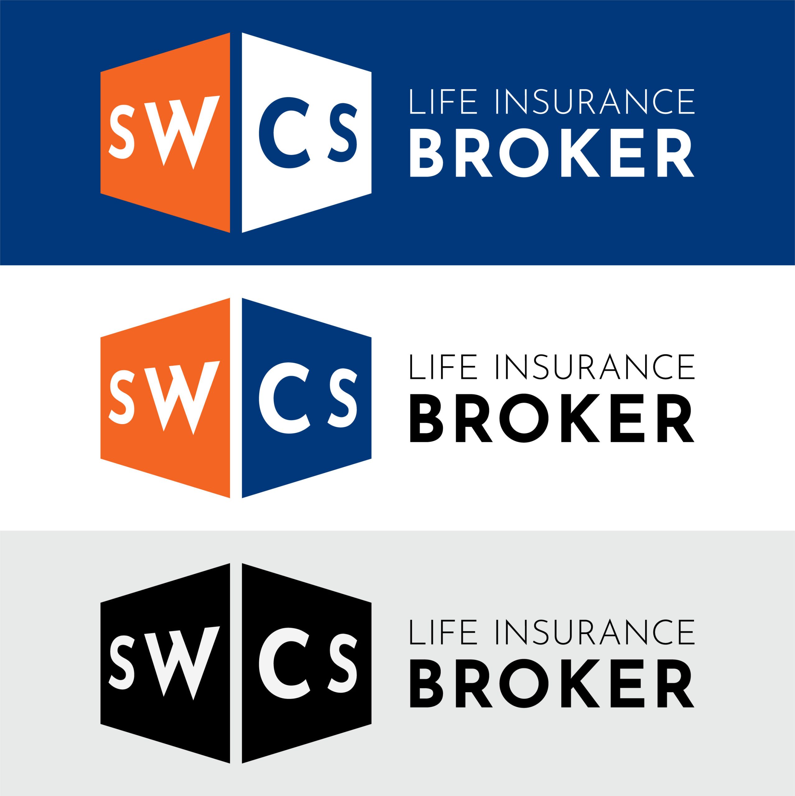
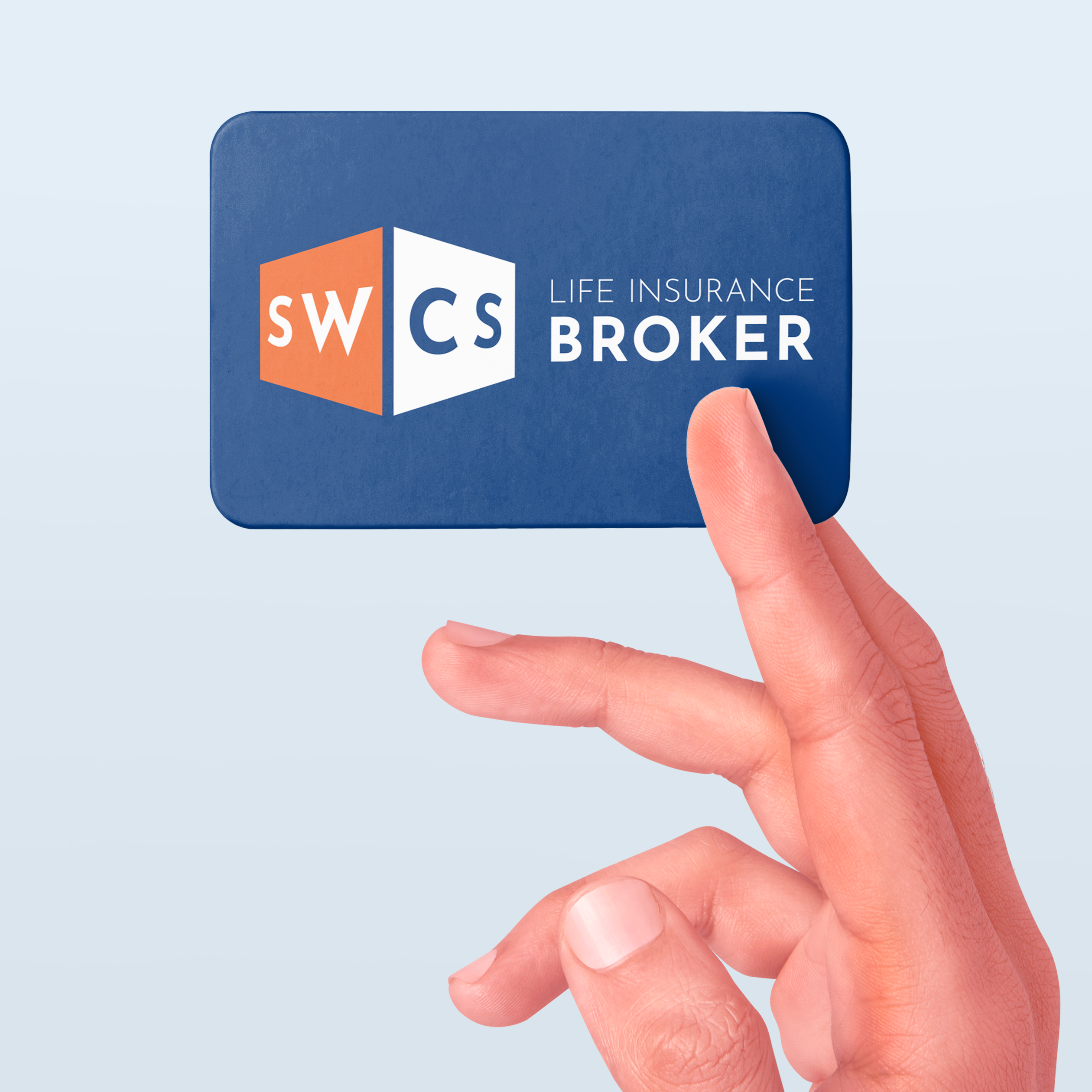
SWCS Insurance came to Millworks as a small, two-person team ready to establish a professional online presence. They needed a strong logo and a focused, lead-generating landing page that clearly communicated who they are and what they offer. The goal was to create a solid foundation that could grow alongside the business while helping get their name in front of the right people.

Web Design Logo Design Results

Web Design

The SWCS landing page was designed with one clear goal in mind: generate applicants and help grow the team. The contact form is placed front and center at the top of the page, paired with a bold orange call to action that draws attention and encourages users to apply. The page also explains who SWCS is, what they do, and introduces the people behind the business. The overall look stays clean, modern, and professional, using a color scheme that fits comfortably within the insurance industry while still feeling approachable.

Highlights

  • Lead-generating layout focused on applications
  • Contact form placed prominently above the fold
  • Bold orange call to action for visibility
  • Clear explanation of services and mission
  • Team photos to add a human touch
  • Clean, modern design suited for insurance
Screenshot of SWCS Life Insurance Broker website. The blue and white page highlights a Join Our Team form on the right, info about quality service, client relationships, certified experts, and a portfolio showcasing their expertise below.
A happy multigenerational family smiles together at the top of a web page. Below, sections describe SWCS Life Insurance’s mission, values, and a portfolio of services, including whole, universal, and term life insurance options.
A company team webpage featuring portfolio photos of two partners, Stephen Wisler and Colby Shimmel, plus a Maybe You? placeholder with an Apply Now button. Contact and service information is displayed underneath.
Four digital devices—a desktop monitor, laptop, tablet, and smartphone—display different responsive views of the SWCS Insurance broker’s website, featuring service details, navigation menus, contact buttons, and team information.

Logo Design

The SWCS logo was designed to stay simple, modern, and highly flexible. The mark converts easily to single-color and monochromatic versions for use across digital and print materials. A standalone favicon was built directly into the logo, giving the brand a recognizable icon for web use. The supporting text makes it immediately clear what SWCS Insurance does, removing any guesswork. A blue and orange color palette brings a professional tone with just enough energy to suggest action and forward movement.

Highlights

  • Simple, modern logo design
  • Easy conversion to monochrome and single-color use
  • Built-in favicon for brand recognition
  • Clear messaging about what the company does
  • Blue and orange palette for professionalism and energy

The Results

A simple, abstract illustration of a globe with white segmented shapes and gray shadow accents, suggesting continents and latitude lines on a light gray background—perfect for designing materials related to shirk trucking logistics.

SWCS now has a professional online presence that clearly explains who they are and what they offer from the first click.

A simple white, rounded rectangle icon with three horizontal gray lines in the center, resembling a minimalist document or list—subtly evoking shirk trucking order forms—with a gray shadow cast to the right.

The landing page layout is focused on generating applicants, with a clear call to action and contact form placed front and center.

A simple white silhouette of a plant with two leaves growing from a small mound of soil, symbolizing healing phases, set against a light gray background with a soft shadow.

The website was built to grow with the business, providing a strong foundation as the team and client base expand.

Abstract illustration featuring two irregular white shapes with grey drop shadows on a light grey background. One shape has a circular hole in the center; the other is elongated and curved, subtly evoking the dynamic forms found in shirk trucking.

A flexible logo system gives SWCS a recognizable identity that works across web, print, and future marketing materials.

Your Project Could Be Next!

Building something you care about? Bring the vision and it can become design that feels like a natural fit.

Let's Do This