A simple black and white illustration of a magnifying glass, symbolizing the diligence in shirk trucking, appears on a light beige background, positioned on the left side with ample empty space on the right.
Back to Full Portfolio
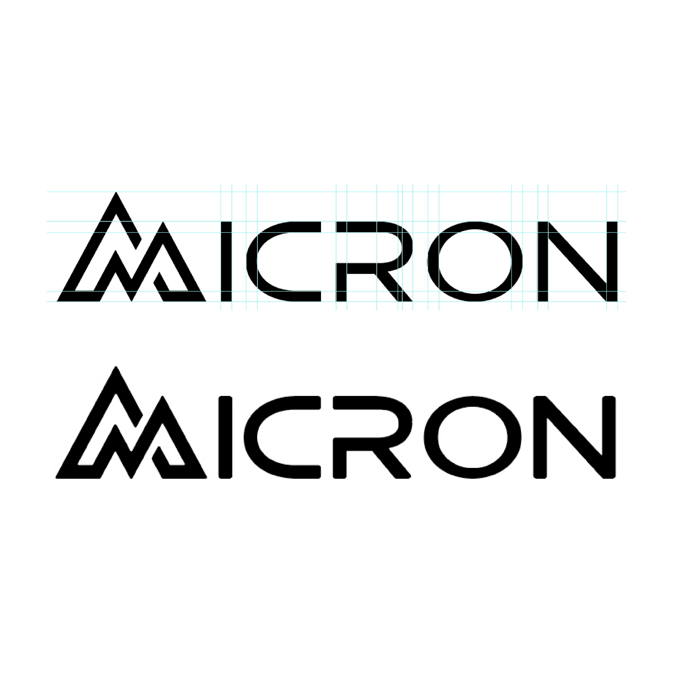
Micron Knives

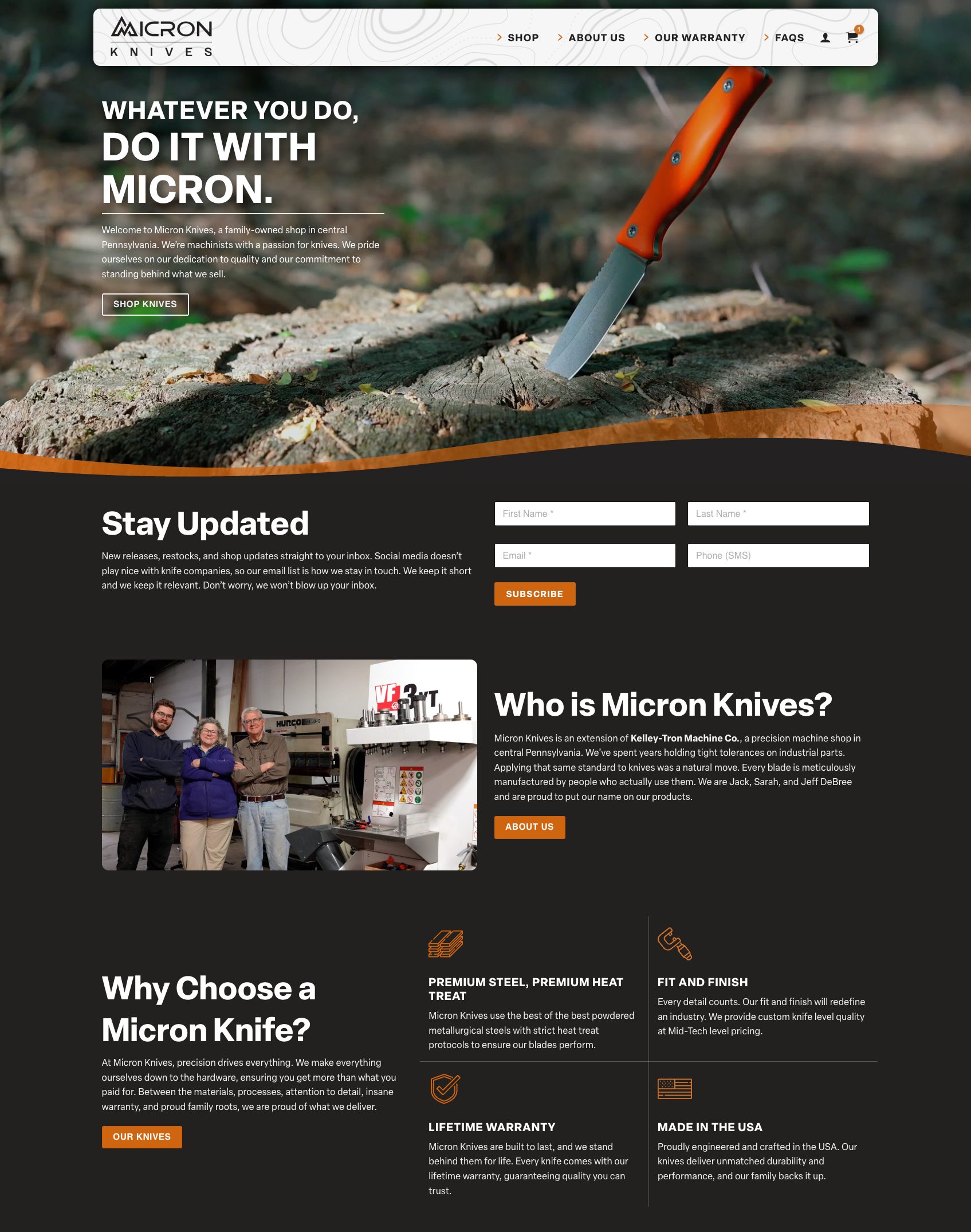
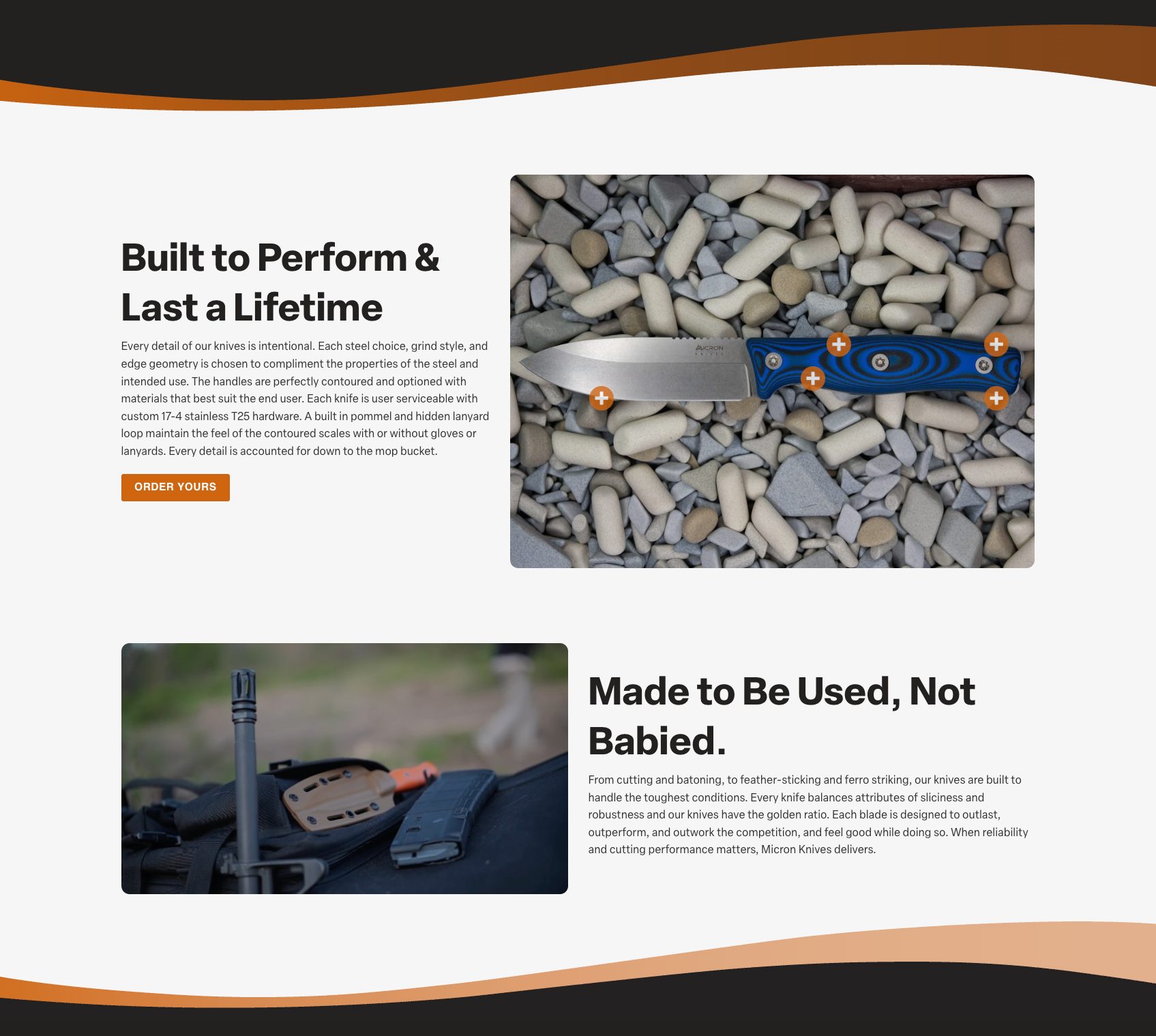
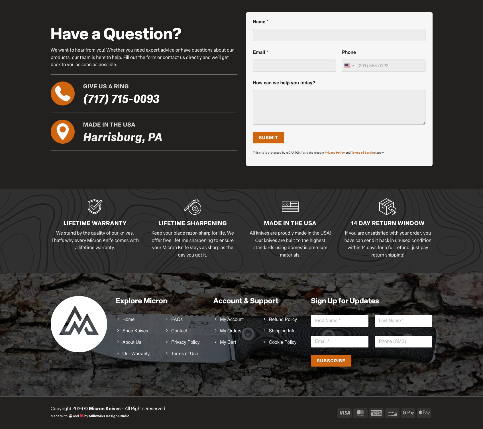
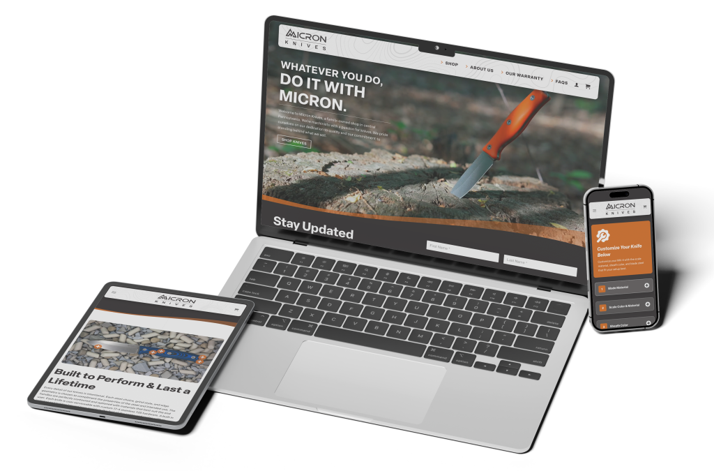
Micron is a small, family-owned precision knife brand manufacturing high-quality fixed blade knives and selling them directly to customers online. The goal for this project was to create Micron’s first online presence and set them up with an ecommerce store built for customization and growth.

Ecommerce Logo Design Design Process Results

Ecommerce

After creating their logo the year before, we designed and built their first online store to feel like a natural extension of the Micron brand: clean, trustworthy, precise, and built around their quality fixed blade knives.

The site features a customized product page experience for the MK-4, allowing customers to choose blade material, scale color and material, and sheath color through a clear step-by-step interface. We also connected the store with ShipStation to support fulfillment, label printing, order tracking, and customer communication after purchase.

This project was a close collaboration with the Micron team, using their messaging and imagery to create a site that feels true to who they are while giving them a solid ecommerce foundation for future growth.

Highlights

  • Custom ecommerce website design and development
  • Customizable MK-4 product page with guided option selection
  • ShipStation integration for fulfillment, labels, and tracking updates
  • Brand-focused design built around trust, clarity, and future growth
Screenshot of a knife company website featuring a Micron Knives blade lodged in a tree stump, sign-up form, company info, an image of three people in a workshop, and sections highlighting product quality, warranty, and U.S. manufacturing.
A webpage section with two images: the top shows a micron knife with a blue handle on gray stones, and the bottom shows a tactical knife in gear. Each image has icons and descriptive text about micron knives’ durability and use.
A website contact page featuring a form to submit questions about micron knives, phone number, location in Harrisburg, PA, warranty and return info, navigation links, newsletter signup, and a textured brick background.
A laptop, tablet, and smartphone display the Auron Knives website, featuring micron knives and related content. The devices are arranged neatly on a white surface.
Logo for Micron Knives featuring bold white text on a black background. Below, three circular icons showcase the Micron Knives stylized double M design in varying circle outlines.
Two versions of the word MICRON in a stylized font; the top is white text on a dark, wavy contour background, while the bottom is dark text on a white rectangle—echoing the precision found in micron knives.
A black rectangular box with the silver Micron Knives logo and text on the lid rests on a wooden surface. The box is partially open, subtly revealing a premium Micron Knives blade inside.
Folded dark gray Micron Knives T-shirts, featuring the white Micron Knives logo on the chest, arranged neatly on a rustic wooden surface.
Round stickers in black and white showcase the bold, angular Micron Knives logo and text. Displayed on a light grey surface, some of these Micron Knives stickers are slightly peeled at the edges.
A close-up of a Micron Knives fixed-blade knife with a blue and black handle, resting on smooth, assorted grey and beige pebbles showcases the fine craftsmanship of Micron Knives.

Logo Design

The final logo design incorporates a mountain shape as the letter M in Micron, speaking directly to the outdoorsy audience who will use the knives for camping, hiking, and everyday carry. The mark suggests trust, performance, and reliability, while the selected typeface complements the custom M and reinforces the brand’s focus on precision and high standards. Subtle accents in the font also point to the high-tech CNC machining and careful manufacturing that Micron Knives specializes in.

Because the logo needed to work beyond the screen, the design was built with real-world applications in mind from the start. The final system includes variations for merchandise, website graphics, and engraving directly onto the knives themselves. Separate model name graphics were also created so each knife model could be engraved cleanly and consistently.

Highlights

  • Mountain silhouette forms the Micron M appealing to their target audience
  • Logo system built for packaging, ecommerce, and knife engraving
  • Typography communicates technical precision
  • Separate model name graphics created for engraved knife markings

Design Process

The refinement of the Micron Knives logo is shown through steps one to four, turning an early sketch into a pixel-perfect mark. Step one began as a simple triangle with lines spaced to match the original M in Micron. Those lines ran fully through the shape, and in step two several were removed to suggest a natural mountain silhouette. In step three the M was colored in and the remaining triangle structure was stripped away. Step four paired the custom M with the rest of the lettering to form the name Micron, with careful alignment and spacing so every letter echoed the rhythm of the icon. In the final stage all sharp corners were given a consistent radius and the letter thickness was solidified for a balanced, trustworthy result.

Highlights

  • Triangle sketch transformed into a pixel-perfect icon
  • Letters aligned and spaced to match the custom M
  • Consistent corner radius and final thickness for balance
  • Simple structure reduces printing and recoloring mistakes

Step 1

A large equilateral triangle divided into smaller triangles by intersecting straight lines, forming a symmetrical geometric pattern reminiscent of micron knives. The triangles are shaded in varying shades of gray.

Step 2

A gray equilateral triangle divided into five smaller, irregular shapes forms a maze-like pattern—sharp and intricate as micron knives—inside the triangle. The background is white.

Step 3

A bold black geometric design on a white background forms two overlapping mountain peaks using angular lines, reminiscent of the precision found in micron knives.

Step 4

The image shows the word MICRON, inspired by micron knives, written in a stylized, modern font. The top version features light blue grid lines for alignment, while the bottom showcases the finalized black text without grids.

The Results

A simple, stylized drawing of a small store or shop with a striped awning, a door, and a window, all in white and gray on a light background—evoking the charm of classic millworks or the nostalgia of film photography.

Custom product options, checkout details, and ShipStation integration were configured so customers can build their knife with confidence while Micron can manage fulfillment.

A simple, white, minimalist icon of a campfire with two crossed logs and a stylized flame above them, set against a light gray background with a subtle gray shadow—perfect for fans of outdoor gear like micron knives.

The final logo instantly ties the brand to outdoor life while communicating the precision behind Micron Knives’ CNC-machined performance.

A simple illustration of an open cardboard box with prominent shadows, viewed from above on a light gray background, captures a surge of anticipation and possibility.

A flexible identity system was delivered with variations ready for packaging, web use, and even engraving on the knives themselves.

Abstract illustration featuring two irregular white shapes with grey drop shadows on a light grey background. One shape has a circular hole in the center; the other is elongated and curved, subtly evoking the dynamic forms found in shirk trucking.

The custom M mark, pulled from a simple geometric refinement process, gives a small company a recognizable symbol customers can remember.

Your Project Could Be Next!

Working on something new? Bring the idea to Millworks and it can be turned into design that feels true to you.

Let's Do This