A simple black and white illustration of a magnifying glass, symbolizing the diligence in shirk trucking, appears on a light beige background, positioned on the left side with ample empty space on the right.
Back to Full Portfolio
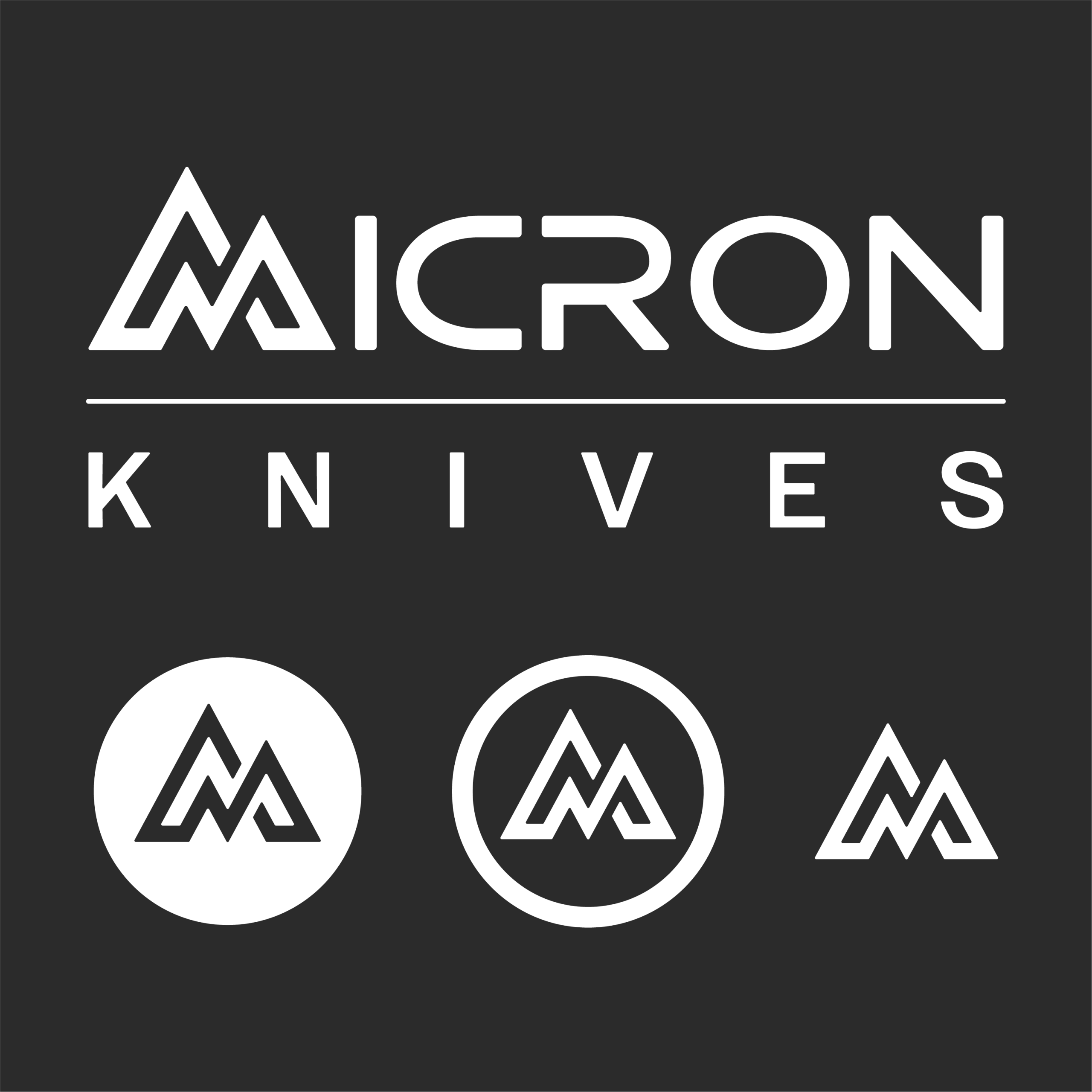
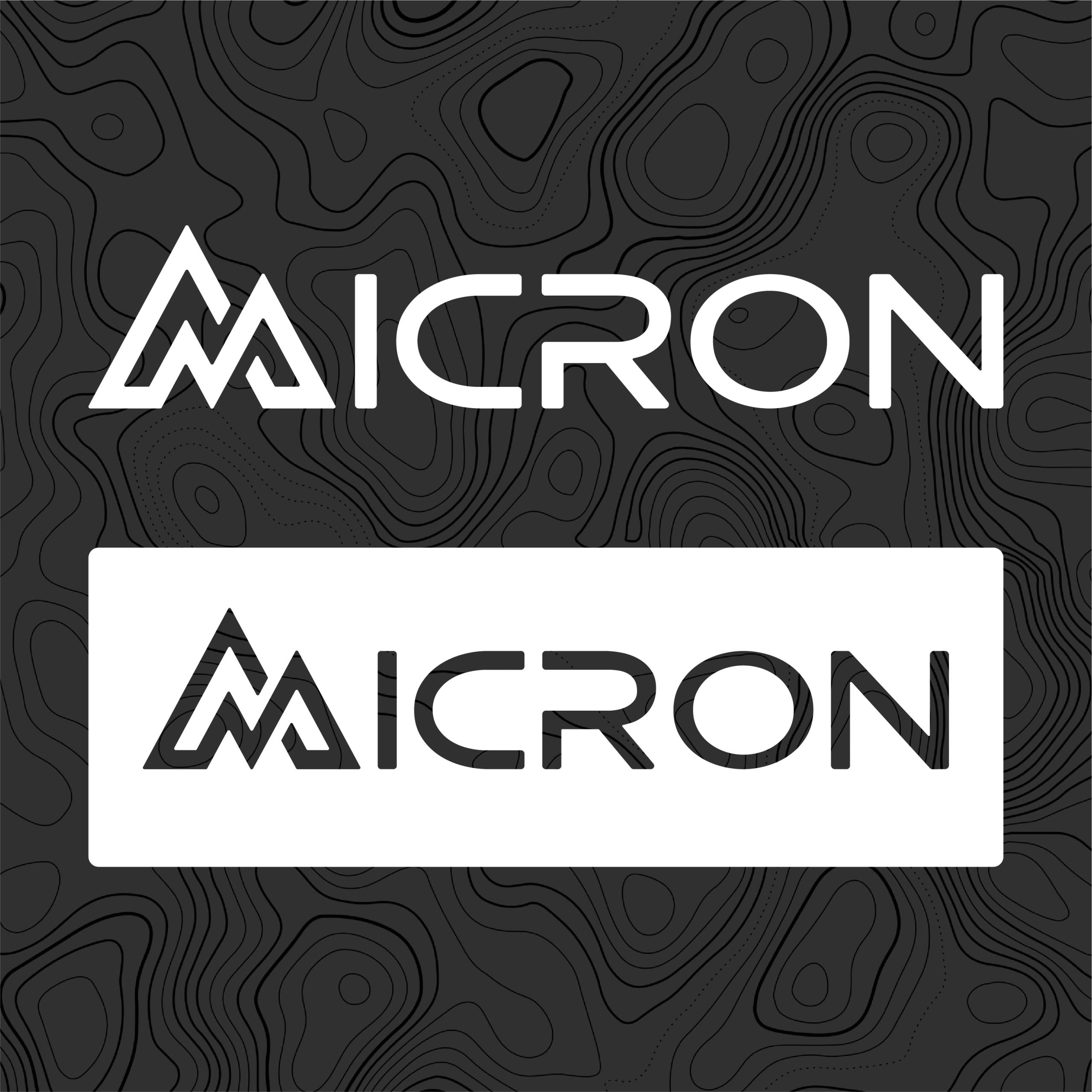
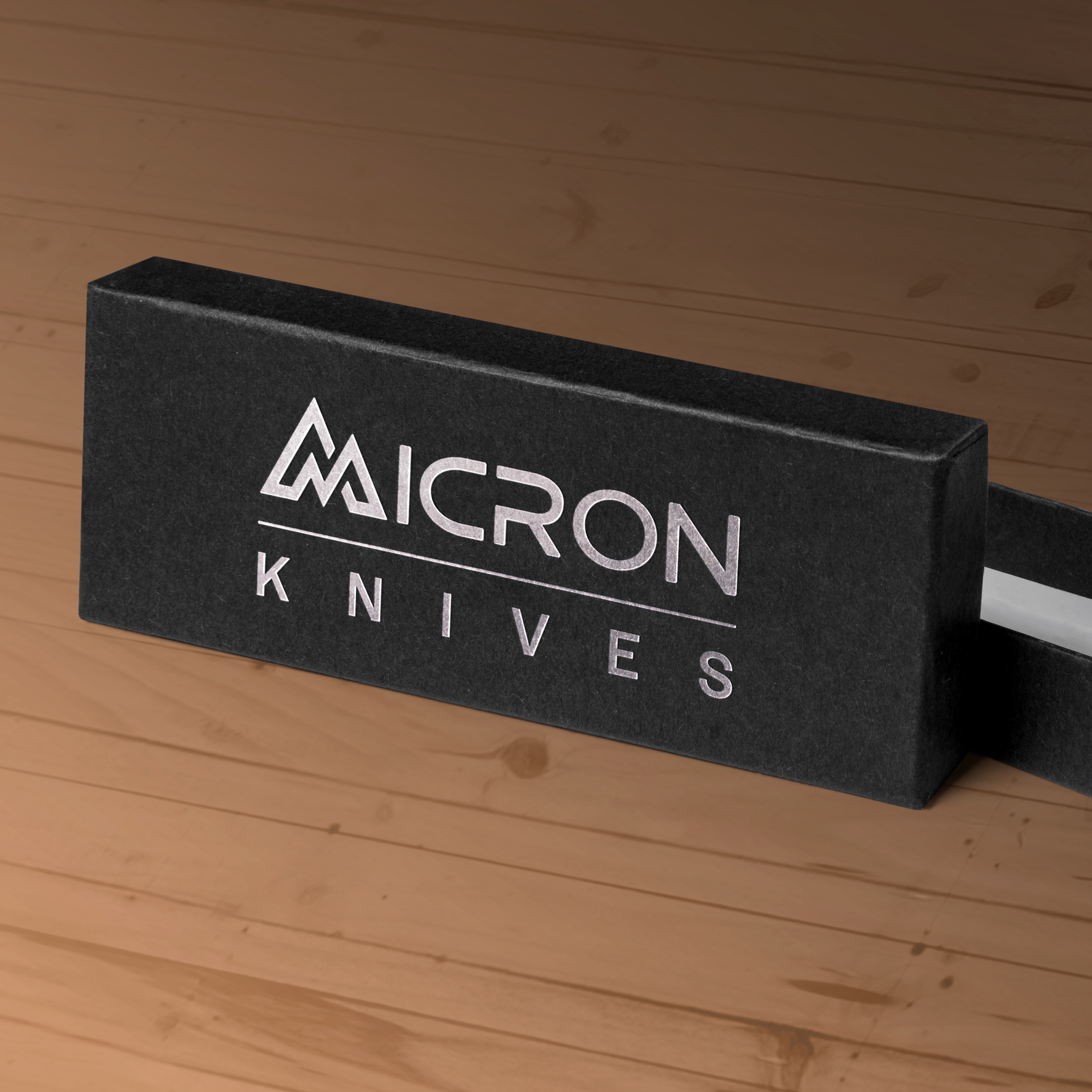
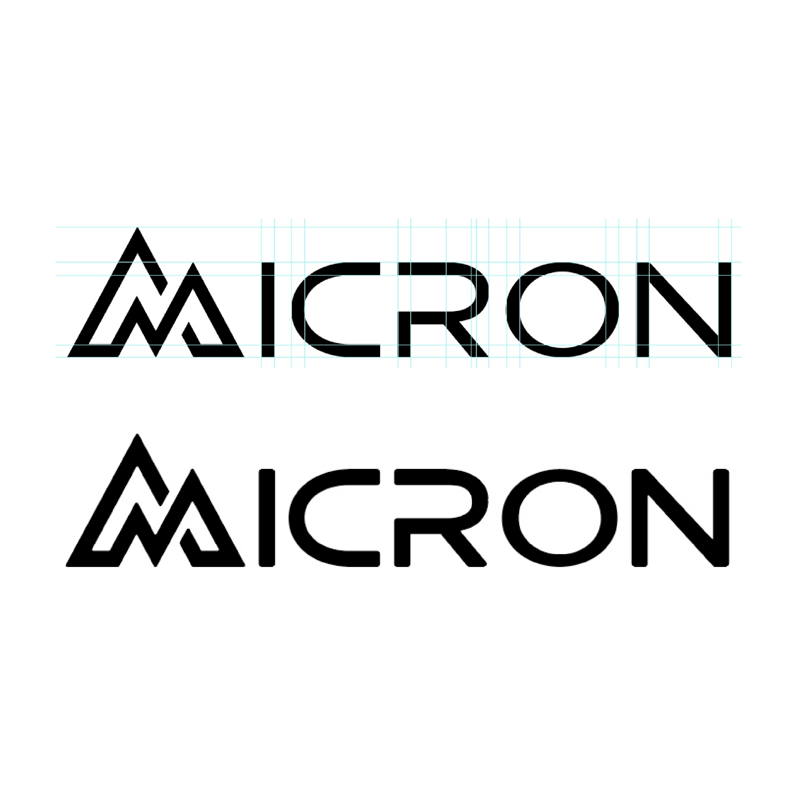
Micron Knives

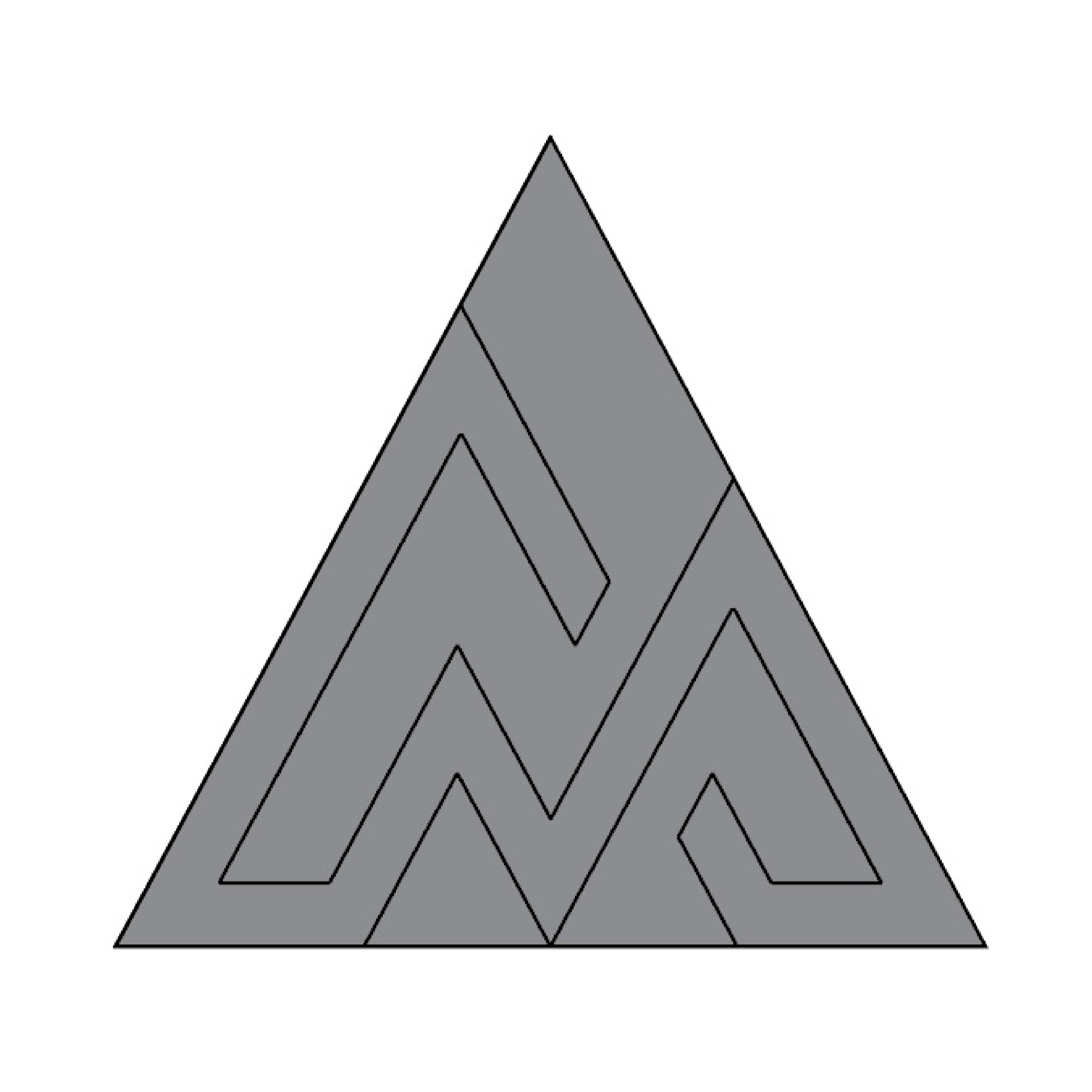
Micron Knives is a small knife company focused on highly precise CNC machining and products for everyday carry, outdoor adventures, and real-world use. They came to Millworks looking for logo design, and the goal was to match the precision in their name with the realness and ruggedness of the people who will use their products.

Logo Design Process Results

Logo Design

The final logo design incorporates a mountain shape as the letter M in Micron, speaking directly to the outdoorsy audience who will use the knives for camping, hiking, and everyday carry. The mark suggests trust in performance and reliability. The typeface chosen complements the custom M while reinforcing the idea of precision and high standards. Subtle accents in the font point to the high-tech CNC machining and precise manufacturing that Micron Knives specializes in.

Multiple variations were created for different real-world uses, including packaging, website graphics, and engraving on the knife itself. The mountain M was separated out into a favicon and secondary mark. The logo system is prepared to support the upcoming ecommerce store being built by Millworks, which will launch soon as the next step in the project.

Highlights

  • Mountain silhouette forms the Micron M appealing to their target audience
  • Built for packaging, engraving, and ecommerce use
  • Typography communicates technical precision
  • Standalone favicon created from the primary icon
Logo for Micron Knives featuring bold white text on a black background. Below, three circular icons showcase the Micron Knives stylized double M design in varying circle outlines.
Two versions of the word MICRON in a stylized font; the top is white text on a dark, wavy contour background, while the bottom is dark text on a white rectangle—echoing the precision found in micron knives.
A black rectangular box with the silver Micron Knives logo and text on the lid rests on a wooden surface. The box is partially open, subtly revealing a premium Micron Knives blade inside.
Round stickers in black and white showcase the bold, angular Micron Knives logo and text. Displayed on a light grey surface, some of these Micron Knives stickers are slightly peeled at the edges.

Step 1

A large equilateral triangle divided into smaller triangles by intersecting straight lines, forming a symmetrical geometric pattern reminiscent of micron knives. The triangles are shaded in varying shades of gray.

Step 2

A gray equilateral triangle divided into five smaller, irregular shapes forms a maze-like pattern—sharp and intricate as micron knives—inside the triangle. The background is white.

Step 3

A bold black geometric design on a white background forms two overlapping mountain peaks using angular lines, reminiscent of the precision found in micron knives.

Step 4

The image shows the word MICRON, inspired by micron knives, written in a stylized, modern font. The top version features light blue grid lines for alignment, while the bottom showcases the finalized black text without grids.

Process

The refinement of the Micron Knives logo is shown through steps one to four, turning an early sketch into a pixel-perfect mark. Step one began as a simple triangle with lines spaced to match the original M in Micron. Those lines ran fully through the shape, and in step two several were removed to suggest a natural mountain silhouette. In step three the M was colored in and the remaining triangle structure was stripped away. Step four paired the custom M with the rest of the lettering to form the name Micron, with careful alignment and spacing so every letter echoed the rhythm of the icon. In the final stage all sharp corners were given a consistent radius and the letter thickness was solidified for a balanced, trustworthy result.

Highlights

  • Triangle sketch transformed into a pixel-perfect icon
  • Letters aligned and spaced to match the custom M
  • Consistent corner radius and final thickness for balance
  • Simple structure reduces printing and recoloring mistakes

The Results

A simple, white, minimalist icon of a campfire with two crossed logs and a stylized flame above them, set against a light gray background with a subtle gray shadow—perfect for fans of outdoor gear like micron knives.

The final logo instantly ties the brand to outdoor life while communicating the precision behind Micron Knives’ CNC-machined performance.

A simple illustration of an open cardboard box with prominent shadows, viewed from above on a light gray background, captures a surge of anticipation and possibility.

A flexible identity system was delivered with variations ready for packaging, web use, and even engraving on the knives themselves.

Abstract illustration featuring two irregular white shapes with grey drop shadows on a light grey background. One shape has a circular hole in the center; the other is elongated and curved, subtly evoking the dynamic forms found in shirk trucking.

The custom M mark, pulled from a simple geometric refinement process, gives a small company a recognizable symbol customers can remember.

A stylized white letter A designed to resemble a pen and pencil crossing each other—evoking the precision of micron knives—with a gray drop shadow on a light gray background.

Logo spacing, corner treatment, and type choices were refined so the design feels balanced and trustworthy in every application.

Your Project Could Be Next!

Working on something new? Bring the idea to Millworks and it can be turned into design that feels true to you.

Let's Do This