A simple black and white illustration of a magnifying glass, symbolizing the diligence in shirk trucking, appears on a light beige background, positioned on the left side with ample empty space on the right.
Back to Full Portfolio
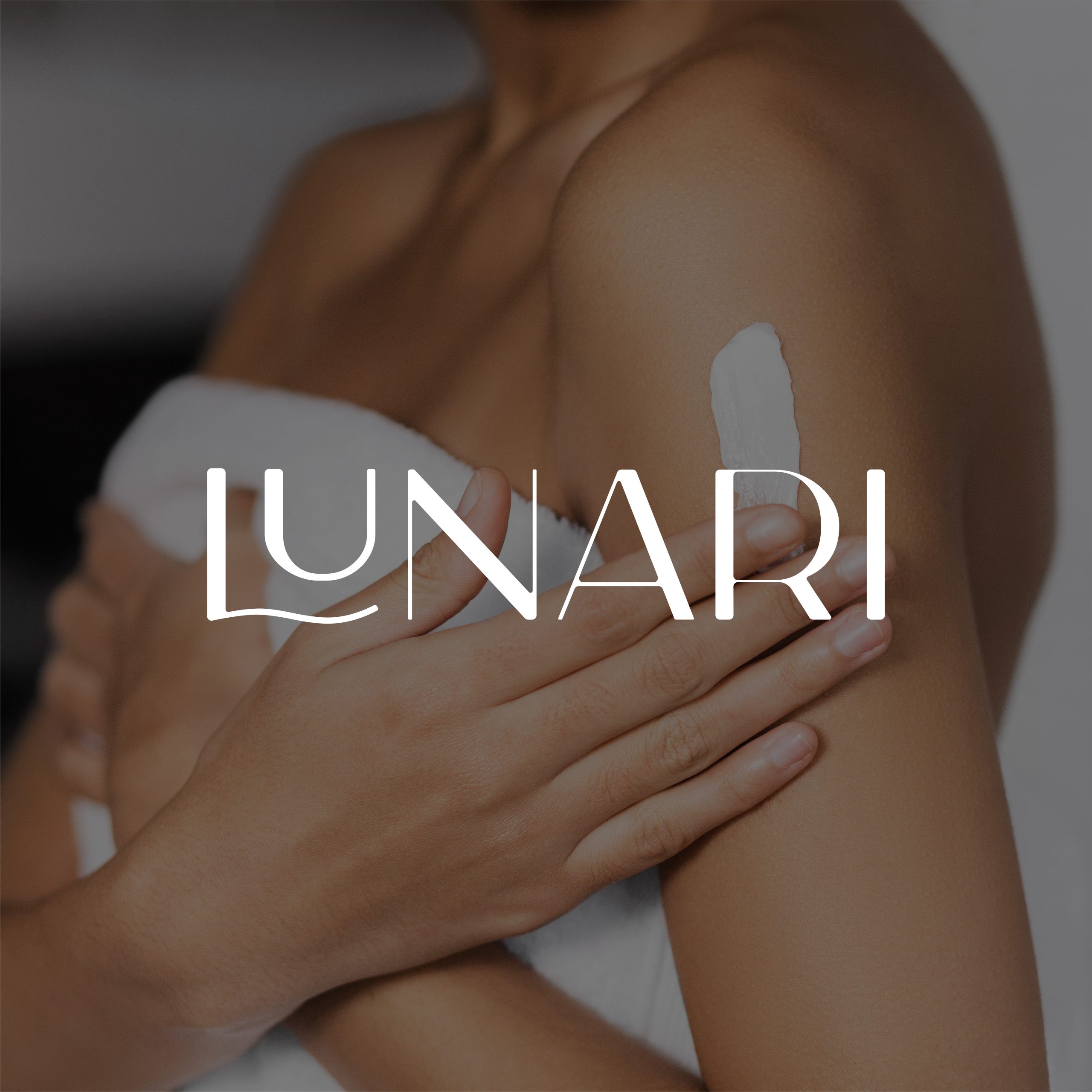
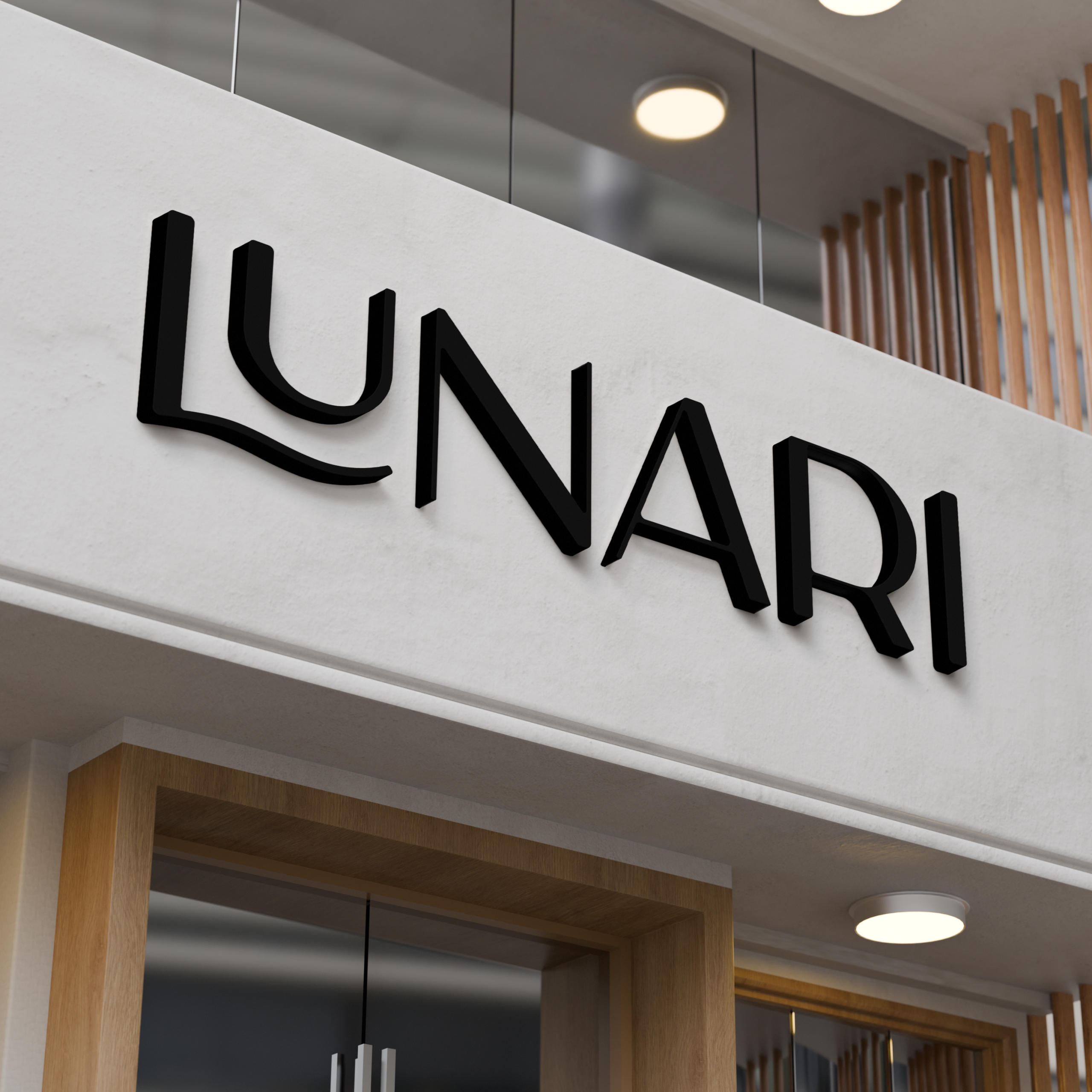
Lunari

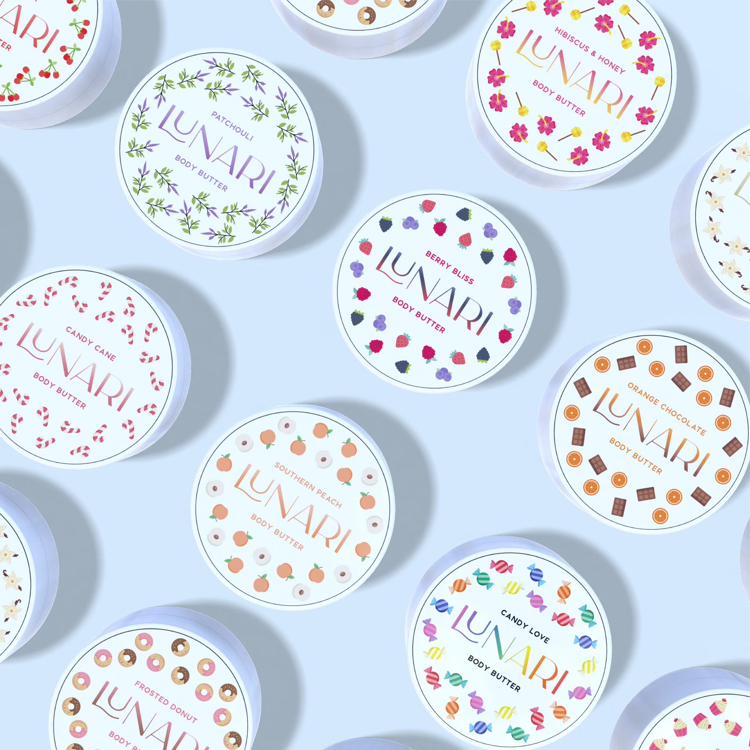
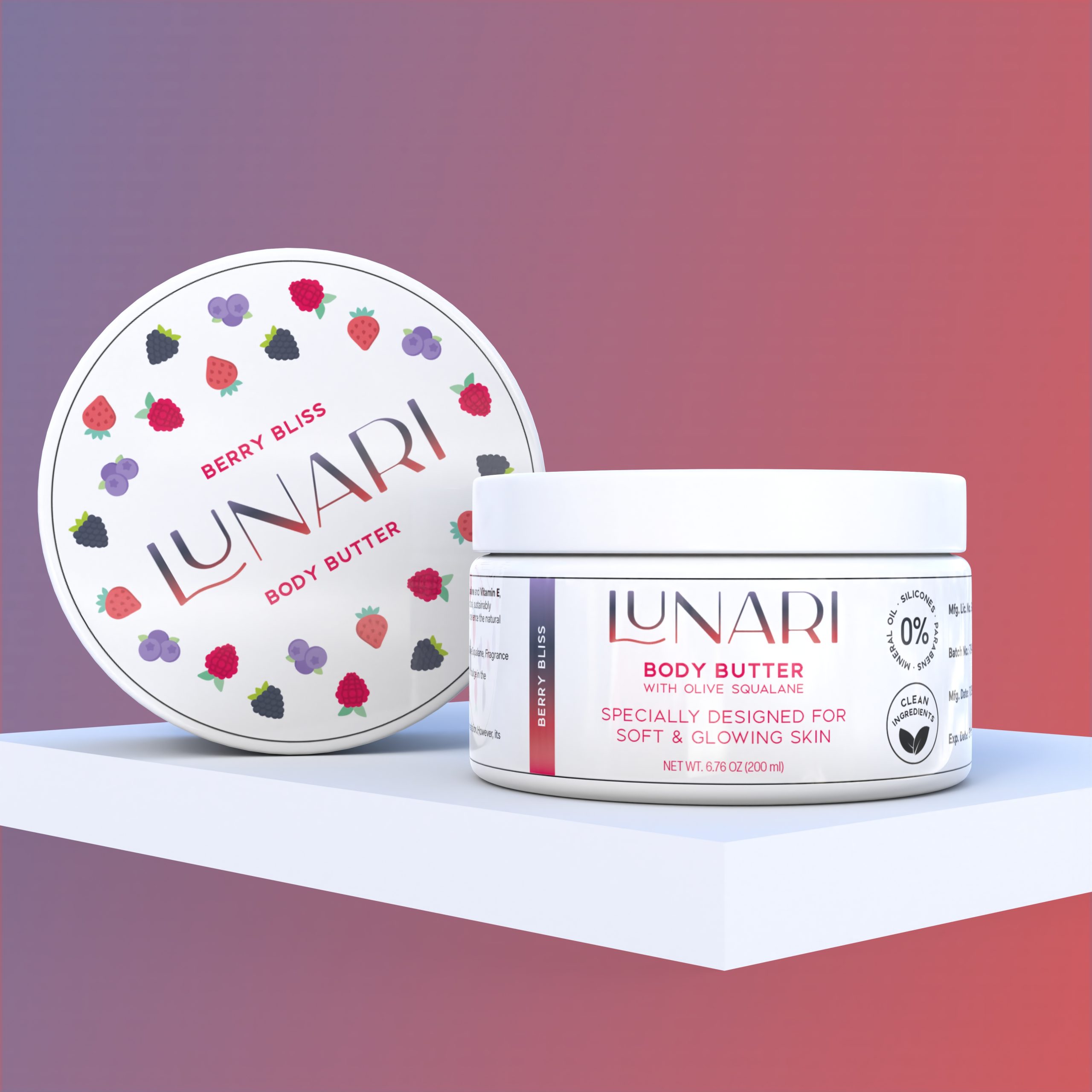
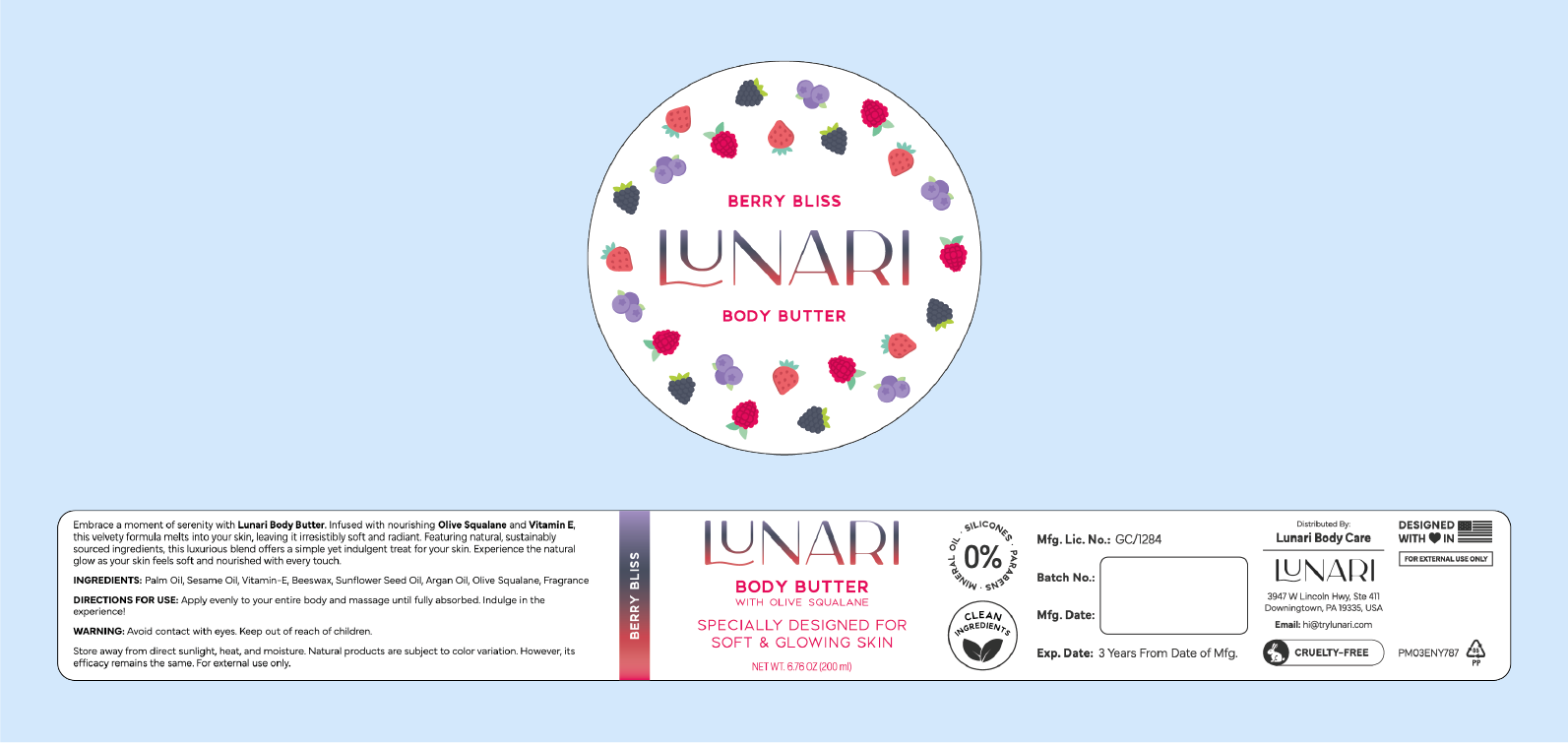
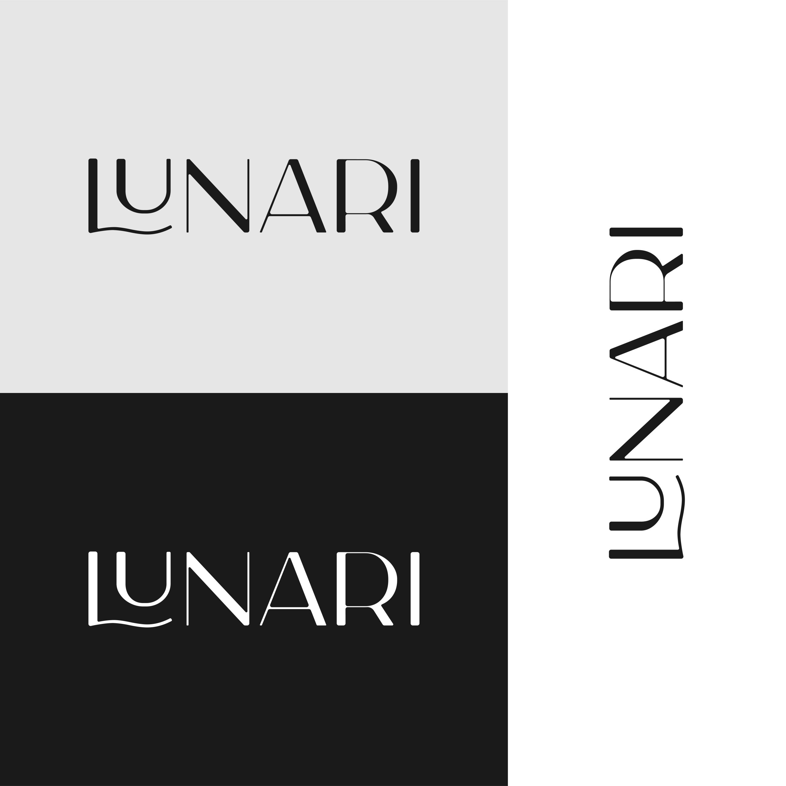
Lunari came to us in 2024 as they were getting their new body butter brand off the ground. They were looking for a fresh logo and packaging die lines for eleven scents to support a confident ecommerce launch. Our goal was to build a cohesive visual identity that felt elegant and natural, giving their customers a sense of quality and care before they even open the jar.

Packaging Design Logo Design Results

Packaging Design

The packaging for Lunari was created to let every scent stand on its own. We worked closely with the client so each label could feature custom, colorful icons and a palette that matched the feeling of the body butter inside the jar. Across eleven scents, we developed separate side and top labels and assembled them into a complete print-ready dieline.

The final dieline system could be taken directly to Lunari’s packaging facility for smooth, no-stress production. The labels highlight the brand’s cruelty-free approach and clear, clean ingredients.

Highlights

  • Custom icons and color palettes for all 11 scents
  • Separate side and top labels for each jar
  • Cohesive visual system designed to grow with new scents
  • Print-ready dieline built for seamless printing
  • Design refined through close client collaboration
  • Values-forward packaging with clear ingredient messaging

Product Mockups

Various round tins of Lunari body butter are arranged on a light blue background. Each Lunari tin features a unique, colorful design matching its scent, with flowers, berries, candy canes, and coffee beans.
A round container of Lunari Berry Bliss Body Butter sits on a white platform. The lid, adorned with colorful berry illustrations and the Lunari logo, is propped beside the jar, which features product details and a purple and white label.
A white jar of Lunari Body Butter with lilac labeling sits on a circular white platform, surrounded by soft purple spheres and a lavender background. The Lunari label highlights its use for soft, glowing skin.
A round container and an open jar of Lunari Southern Peach Body Butter are displayed on pastel blocks. The Lunari packaging features peach illustrations and text highlighting soft, glowing skin benefits.

Packaging Dielines

Circular label design for LUNARI Berry Bliss Body Butter, featuring scattered berry illustrations above and below the LUNARI brand name. The rectangular section provides ingredients, usage instructions, certifications, and company details.
Three lunari logo variations in a modern font: top left on light gray, bottom left on black, and right side vertically on white. Each lunari logo features a wavy underline beneath the U for a unique touch.
A person in a towel applies lotion to their shoulder, radiating self-care. The word LUNARI is displayed in large white letters across the image.
The image shows a modern storefront sign with the word LUNARI in bold, black, uppercase letters on a white background. The wavy L adds flair to the lunari branding. The store features wood accents and recessed lighting.

Logo Design

The Lunari logo was designed to be simple, elegant, and intentionally text-only. A monochromatic palette keeps the mark visually calm and makes it easy to adapt to any color when the brand evolves. The typeface was selected to sit comfortably alongside other luxury and beauty brands, giving Lunari a polished presence without unnecessary complexity.

Highlights

  • Text-only design with an elegant type focus
  • Monochrome palette for calm visual presence
  • Color simplicity allows easy adaptation
  • Typeface aligned with luxury beauty branding

The Results

A minimalist illustration of a rolled sleeping bag above a backpack with a flap, side pockets, and mountain shapes, all in light gray and white with soft shadows on a pale background evokes the calm before an adventurous surge.

The final packaging system was delivered as complete, print-ready dielines, making it easy for Lunari’s manufacturer to plug everything in and move straight to production.

A minimalist, flat design illustration of two blueberries with a leaf, styled in lunari shades of white and light gray on a light background.

Each of the 11 scents received custom icons and dedicated color palettes that matched the feeling of the body butter inside.

Abstract illustration featuring two irregular white shapes with grey drop shadows on a light grey background. One shape has a circular hole in the center; the other is elongated and curved, subtly evoking the dynamic forms found in shirk trucking.

The text-only Lunari logo uses a monochrome, luxury-inspired typeface that adapts easily to new colors and layouts. The simplicity lets the mark evolve alongside the brand.

A minimalist white silhouette of a bunny with a round tail and long ears, casting a soft gray shadow on a light gray background—evoking a gentle, lunari elegance.

Every label highlights Lunari’s cruelty-free approach and clean ingredient transparency, helping the product feel honest and welcoming online.

Your Project Could Be Next!

Got something cooking? We’re here to help transform your idea into design that fits your story.

Let's Do This