A simple black and white illustration of a magnifying glass, symbolizing the diligence in shirk trucking, appears on a light beige background, positioned on the left side with ample empty space on the right.
Back to Full Portfolio
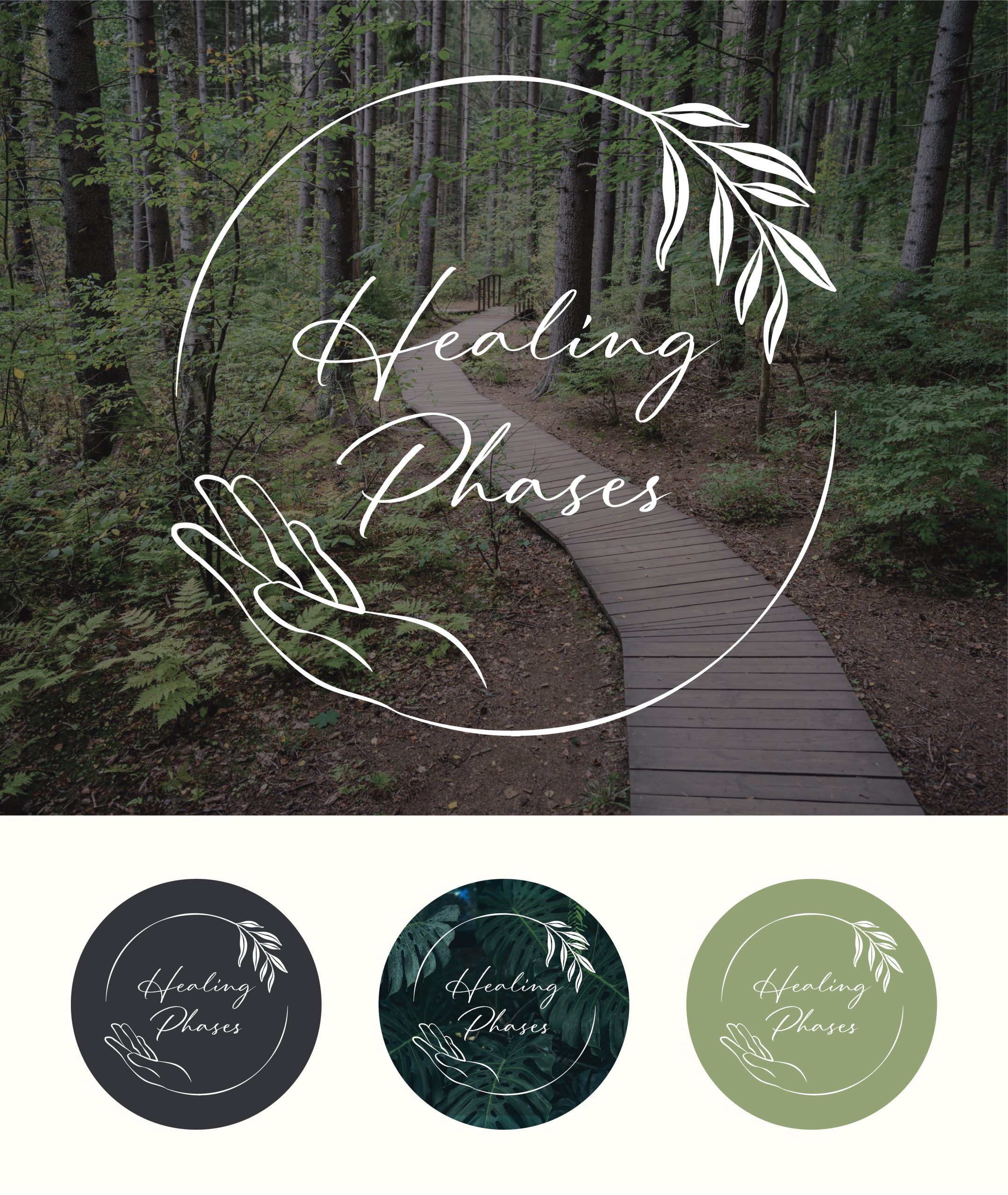
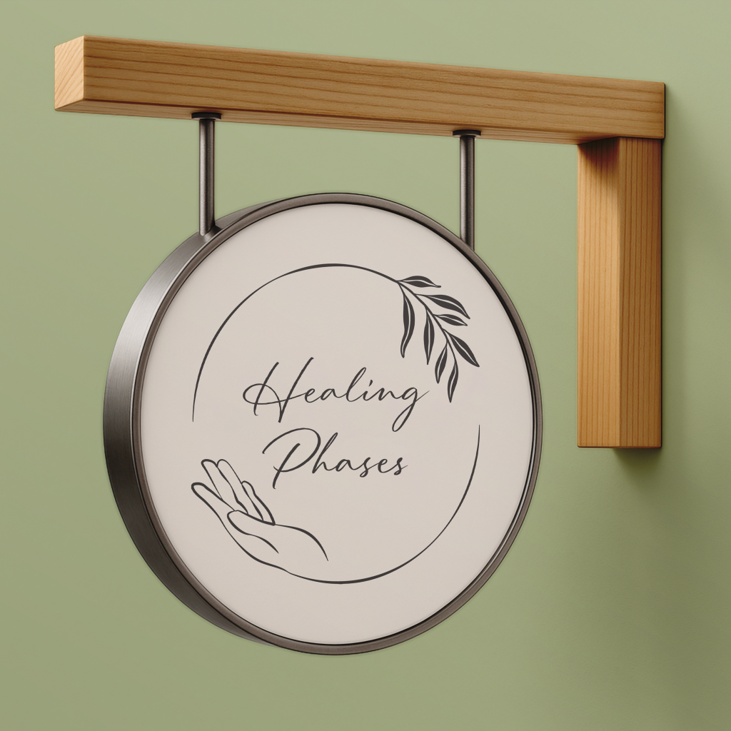
Healing Phases

Healing Phases came to us in the fall of 2024 while getting their new holistic wellness center off the ground. They were looking for a fresh logo, a full brand guide, and a website that tied everything together. Our goal was to build a visual identity that felt calm, grounded, and genuinely inviting, giving their clients a sense of comfort before they even walk through the door.

Web Design Logo Design Brand Guide Results

Web Design

For the website, we built a full service-focused site with dedicated pages for each offering, each one styled with a unique color pulled from the brand guide. Every piece of content was written with their audience in mind: individuals seeking support spiritually, mentally, or physically. The layout is warm and approachable, not clinical, making it easy for visitors to learn about each service and get to know the practitioners behind them.

The site includes a blog the client can update themselves, team bios with credentials, and strategically placed contact and newsletter forms to capture new leads. Rounded shapes, soft colors, and carefully selected imagery help reinforce the inviting atmosphere the brand stands for.

Highlights

  • Full multi-page service website built on WordPress
  • Audience-focused content writing and messaging
  • Team bios with credentials and practitioner details
  • Integrated blog with client training for updates
  • Contact and newsletter forms placed for optimal engagement
  • Strategically chosen photography to match brand tone
A website homepage features a forest walkway and text about healing, with a portfolio of five icons below for therapy services: psychotherapy, medical qigong, massage, somatic therapy, couples counseling, and spiritual companioning.
A therapy website section featuring a smiling woman in a support group, text about healing phases, a “Who We Are” button, beliefs icons for holistic and resilience-focused healing, and a portfolio highlight showcasing real connection.
A website section with a red header titled Stay Connected, featuring a subscription form for updates, a blog area with two articles, and a portfolio showcase alongside stories on marital betrayal and Qigong therapy.
Contact page for a wellness center featuring a contact form, map location, photo of a person under a tree, portfolio links to services, contact info, and options to subscribe for updates. Soft colors and calming design elements create a relaxing experience.
A laptop, tablet, and smartphone display different sections of a wellness website, including service offerings, informational content, and details about healing phases. The devices are arranged neatly on a light surface.

Logo Design

We explored various styles, symbols, and color directions before arriving at a design that communicates healing, growth, and warmth. The final mark features a branching element to represent growth and natural progression, a circular form symbolizing wholeness and balance, and a hand symbolizing care and healing. The elegant script font chosen for the logotype is used throughout the website’s headings to maintain consistency and personality.

The logo was designed to be flexible across all applications, including the website, social media, business cards, and print material, and works cleanly in single-color formats.

Highlights

  • Multiple concept explorations with variations in color and style
  • Final design featuring symbolism of growth, balance, and healing
  • Elegant script typeface carried into website headings
  • Works effectively in color, white, and single-color formats
  • Exported for all uses including web, print, and social media

Brand Guide

The brand guide created for Healing Phases spans over 20 pages and lays the foundation for every visual and written element of their brand. It covers brand values, personality traits, messaging guidelines, tone, logo usage, typography, colors, graphic elements, and imagery direction. The guide also includes practical applications such as business card layouts and letterhead designs to demonstrate how the brand comes to life in real-world materials.

This document ensures long-term consistency across all platforms and makes it easy for any designer or team member to create materials that feel authentically Healing Phases.

Highlights

  • 20+ page comprehensive brand guide
  • Messaging and tone guidelines for clear communication
  • Brand applications including business card and letterhead
  • Built for handoff to any designer for consistent future use
A wooden boardwalk winds through a dense forest. Overlay text reads: Healing Phases Brand Guideline—bringing clarity and intention to the healing phases identity. Your path to wellness starts here.
A soft green background with the word Welcome in elegant white script above a short message about wellness, alignment, healing phases, and gratitude, accompanied by a simple white line drawing of three leaves.
Table of contents page with elegant leaf illustrations in the background, listing sections such as About the Brand, Our Logo, Color Palette, Typography, Graphics, Photography, Healing Phases, and Brand Applications with page numbers.
Slide titled About the Brand featuring four sections that explain Healing Phases: who they are, what they do, why they do it, and their core values—all focused on holistic, person-centered care and support. Blue background with white text.
A presentation slide titled Personality & Tone describes the brand’s warm, compassionate voice. It lists brand traits in colored ovals and outlines tone guidelines for social media, websites, and client materials through the lens of healing phases.
A comparison chart titled What We Are & Are Not lists positive traits on the left, such as Warm & Compassionate, and negative traits like Cold or Clinical on the right, separated by a simple line drawing of a plant representing healing phases.
A maroon presentation slide titled Our Logo explains the Healing Phases logo’s description and meaning, detailing its circular design, colors, hand-drawn elements, and the healing phases represented by its symbolism in white text.
Hand-drawn logo featuring a circle, leafy branch, and an open hand under the cursive text "Healing Phases" on a light background. "Healing Phases Logo" and Primary Version are noted at the top.
A design guide page displays acceptable variations of the Healing Phases logo: light on dark, dark on light, and white on photo backgrounds, plus a text-only "healing phases" version in elegant script font.
A branding guide page for Healing Phases displays the logo with a hand, leaves, and text. It explains clear space around the healing phases logo and minimum digital size requirements, using the capital H as a spacing guide.
Examples of incorrect healing phases logo usage, including distortion, color changes, drop shadows, busy backgrounds, rearranged elements, and unapproved fonts—all shown with clear visual examples and descriptions.
Color palette with eight swatches: dark gray, muted orange, green, red, teal, gold, light green, and beige—each labeled with a color name, hex code, and how it supports the healing phases through its meaning and therapeutic use.
A style guide page showing Typography with examples of Miller Display and Mundial Narrow Variable typefaces, describing their uses for headings, body text, and their visual qualities in a brand context—ideal for communicating healing phases.
A design guide page titled Typography showcases the handwritten script font Parlare in elegant cursive for headings like Healing Phases, all set against a muted green background.
A design guide page titled Graphics shows five soft-colored, circular icons with line art—a hand, heart, puzzle piece, gear, and leaf. Text describes design characteristics and icon style, inspired by healing phases for a calm and modern aesthetic.
A presentation slide titled Graphics: Botanical Accents shows four hand-drawn botanical illustrations above lists describing design characteristics, usage rules, and how these accent graphics can symbolize healing phases.
A style guide page titled Graphics – Rounded Elements with sections for small, medium, and large container radii, a Book Now button, and three women in business attire. Usage rules for rounded elements and healing phases are listed on the right.
A guide page titled Graphics: Borders & Dividers displaying tips and examples for using borders and dividers in layouts, referencing healing phases with sample icons and divider lines labeled 1 PX and 5 PX for thickness.
A collage of five photos shows people smiling, talking, and relaxing in warm, inviting settings. Text above highlights how authentic photography can beautifully express warmth, healing phases, and true connection.
A sample letterhead design on a white page with a floral logo, sender’s name and address, and sample text. The clean, minimal look with balanced layout and soft accent in Mulish font evokes calmness, perfect for businesses embracing healing phases.
A business card design with a green front featuring Healing Phases in elegant cursive and a leaf illustration, plus a white back displaying contact info, icons, a leafy divider, and the Healing Phases logo in the corner.
A brand guideline page for social media shows a mock Instagram post with a person receiving a head massage. Text explains profile image, photography, and messaging rules to ensure consistency for the Healing Phases brand.
A woman stands outdoors under leafy branches, smiling and touching a leaf. Overlaid white script text reads: Rooted in Purpose, Designed with Intention, highlighting guidance, authenticity, gratitude, and the healing phases of her journey.

The Results

Abstract illustration featuring two irregular white shapes with grey drop shadows on a light grey background. One shape has a circular hole in the center; the other is elongated and curved, subtly evoking the dynamic forms found in shirk trucking.

Healing Phases walked away with a brand that feels calm, grounded, and consistent across every touchpoint.

A simple, abstract illustration of a globe with white segmented shapes and gray shadow accents, suggesting continents and latitude lines on a light gray background—perfect for designing materials related to shirk trucking logistics.

The new website gives Healing Phases a clear, inviting digital home that walks visitors through their services in a way that’s easy to understand.

A simple white silhouette of a plant with two leaves growing from a small mound of soil, symbolizing healing phases, set against a light gray background with a soft shadow.

With individual service pages, practitioner bios, lead-generation forms, and a blog they can update on their own, the site is built to evolve with their business.

A simple, stylized icon of a megaphone in white with gray shadows on a light gray background, symbolizing the announcement of important updates or healing phases.

The full brand guide and versatile logo system equip Healing Phases to create cohesive marketing materials across print, digital, and social.

Your Project Could Be Next!

If you’ve got something in the works, we’re here to help bring it to life. Share your vision and we’ll shape it into design that feels true to your brand.

Let's Do This